[vc_row css_animation=”” row_type=”row” use_row_as_full_screen_section=”no” type=”full_width” angled_section=”no” text_align=”left” background_image_as_pattern=”without_pattern”][vc_column][vc_facebook type=”button_count”][vc_pinterest][vc_tweetmeme][/vc_column][/vc_row][vc_row css_animation=”” row_type=”row” use_row_as_full_screen_section=”no” type=”full_width” angled_section=”no” text_align=”left” background_image_as_pattern=”without_pattern”][vc_column][vc_column_text]Every year, interior designers, architects, artists, and other professionals in the design industry eagerly await Pantone’s announcement of their color of the year. The movement started over 20 years ago when the Pantone Color Institute was born as a way to influence product development and purchasing decisions in multiple industries.
This year, Pantone revealed the color of the year for 2020 is Classic Blue, a “reflective, anchoring and self-assured” hue, “relaxed and restful — meant to offer us all a sense of needed tranquility,” said a spokesperson from Pantone.
While this shade of blue is as traditional as it comes, that doesn’t mean you’ll be limited in designs for 2020. In fact, we’ve found the opportunities are endless with classic blue. To get your creative juices flowing about what to do with this color, we’ve put together a few ideas to help you incorporate classic blue into your designs.
[/vc_column_text][/vc_column][/vc_row][vc_row css_animation=”” row_type=”row” use_row_as_full_screen_section=”no” type=”full_width” angled_section=”no” text_align=”left” background_image_as_pattern=”without_pattern”][vc_column][vc_column_text]Mid Century Modern Take on Classic Blue
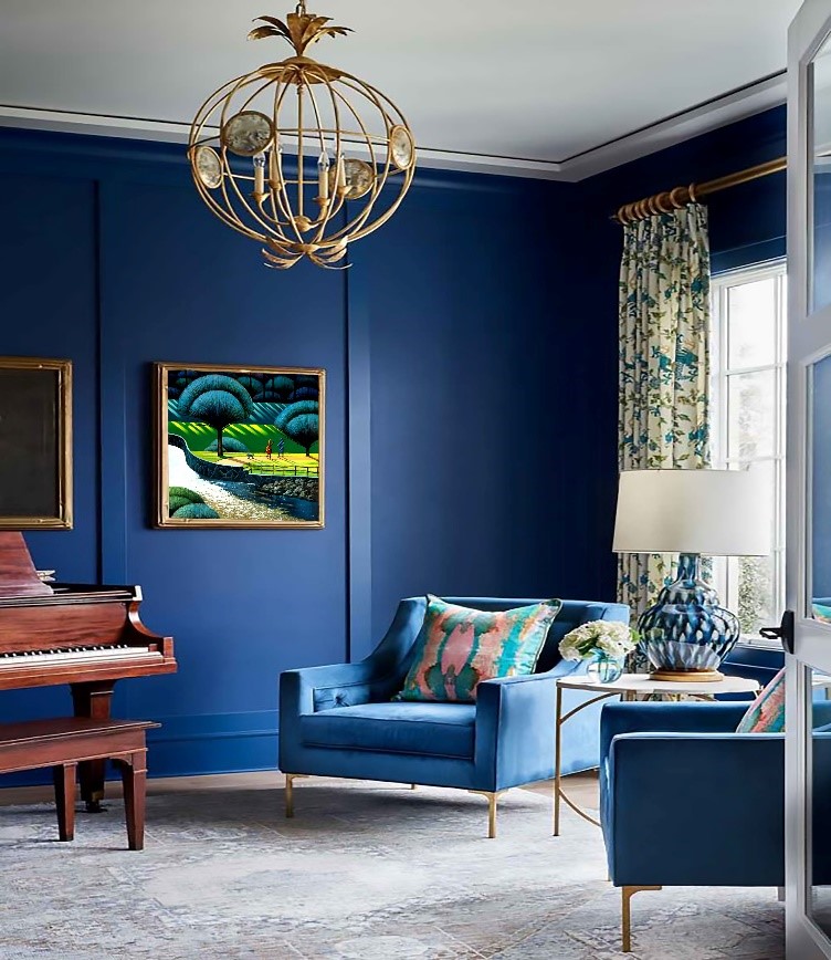
The mid-century modern design has been seen everywhere for years now and doesn’t show signs of slowing down. When we think of mid-century modern, we think of Mad Men – the retro look of the 50s that uses bright colors and bold patterns capture the iconic period of art and design.
Take a look at how we paired this art deco oil painting by Richard McMurray, a local artist represented at Broadway Gallery, into this classic blue interior for a mid-century modern look.
Richard successfully creates the illusion of distance in his harmonious paintings using many elements of design: line, color, shape, pattern, texture, scale, value and direction. His compositions are complex leading the viewer from the foreground of his landscapes to the distant horizons.
This bold classic blue room is simply stunning and the artwork pops on the walls.[/vc_column_text][/vc_column][/vc_row][vc_row css_animation=”” row_type=”row” use_row_as_full_screen_section=”no” type=”full_width” angled_section=”no” text_align=”left” background_image_as_pattern=”without_pattern”][vc_column][vc_single_image image=”2874″ img_size=”large” add_caption=”yes” alignment=”center” qode_css_animation=””][/vc_column][/vc_row][vc_row css_animation=”” row_type=”row” use_row_as_full_screen_section=”no” type=”full_width” angled_section=”no” text_align=”left” background_image_as_pattern=”without_pattern”][vc_column][vc_column_text]Bold Trim And Ceilings
Kelley Mason, stylist at Lulu & Georgia says high contrast design will be making a big comeback in 2020. “[It gives] an otherwise more monochromatic room a crispness and a fresher take on neutrals,” she says. “…especially in graphic or Art Deco inspired patterns.” Take a look at this interior and how it utilizes bold classic blue paint throughout the walls and ceilings. The chandelier and bright red accent table add just the right amount of elegance to the room. We paired it with a piece by Australian artist Ken Strong. Now that’s a statement![/vc_column_text][/vc_column][/vc_row][vc_row css_animation=”” row_type=”row” use_row_as_full_screen_section=”no” type=”full_width” angled_section=”no” text_align=”left” background_image_as_pattern=”without_pattern” z_index=””][vc_column width=”1/6″][vc_single_image image=”2878″ img_size=”large” add_caption=”yes” qode_css_animation=””][/vc_column][vc_column width=”2/3″][vc_single_image image=”2876″ img_size=”large” add_caption=”yes” alignment=”center” qode_css_animation=””][/vc_column][vc_column width=”1/6″][vc_single_image image=”2879″ img_size=”medium” add_caption=”yes” alignment=”right” qode_css_animation=””][/vc_column][/vc_row][vc_row css_animation=”” row_type=”row” use_row_as_full_screen_section=”no” type=”full_width” angled_section=”no” text_align=”left” background_image_as_pattern=”without_pattern”][vc_column][vc_column_text]Countryside Chic
It seems like the farmhouse look will never go out of style; instead it only continues to evolve. This year, we’ll be seeing country chic take on a sophisticated, European-inspired look, according to Rebecca Breslin of Wayfair Professional. See how this room blends classic blue with softer hues for a more refined, elegant take on country chic. This interior style matches perfectly with Broadway Gallery artist Frederick Eberhart’s mosaic photography. Pictured here, “Widewater Mist,” digital photograph.[/vc_column_text][/vc_column][/vc_row][vc_row css_animation=”” row_type=”row” use_row_as_full_screen_section=”no” type=”full_width” angled_section=”no” text_align=”left” background_image_as_pattern=”without_pattern”][vc_column width=”1/2″][vc_single_image image=”2877″ img_size=”large” add_caption=”yes” qode_css_animation=””][/vc_column][vc_column width=”1/2″][vc_single_image image=”2882″ img_size=”large” add_caption=”yes” alignment=”right” qode_css_animation=””][/vc_column][/vc_row][vc_row css_animation=”” row_type=”row” use_row_as_full_screen_section=”no” type=”full_width” angled_section=”no” text_align=”left” background_image_as_pattern=”without_pattern”][vc_column][vc_column_text]Custom Designs
According to Forbes, in 2020, people will be “designing their homes to reflect their personalities and creating spaces that tell their story. What makes you truly happy is more important than what you see in magazines or on social media.” We can’t think of a better place for custom designs than Broadway Gallery, where we represent unique artists from all over the globe.
Hiromi Ashlin is one such artist whose originality can’t be seen elsewhere. Hiromi is an origami master who creates zen-eques designs through the repetition of pattern and movement of thousands of origami pieces per work. Look how this interior space utilizing classic blue is transformed when paired with one of Hiromi’s custom designs.
Wherever you decide to go with classic blue this year, the opportunities are endless and you can look no further than Broadway Gallery for the right artwork to achieve the look you want. If one thing is clear, we can already see that classic blue won’t be limited. We are living in modern times and that’s part of the beauty of Pantone’s choice. As Laurie Pressman, Vice President of the Pantone Color Institute, told TIME, “We’re returning to classics because everything has been chaotic in the world,” Pressman said. “It’s not about doing it like you did in the past, but reinterpreting it.”
Contact Broadway Gallery today for a free consultation![/vc_column_text][/vc_column][/vc_row]


Comments are closed